Preface
It is in the very nature of falling down “rabbit holes” that learning one thing leads to another, and another ad infinitum. It’s only fitting, then, that the final section of Down the front-end rabbit hole (on CSS Grid) began to suffer from some serious informational bloat, and minor topical drift. So, in an effort to factor things out, my notes on CSS Grid and accessibility continue here.
All prior caveats apply. These are merely the notes of a new learner, and I can only promise to direct you to the sources of information (all of which are infinitely more comprehensive and reliable than the notes themselves). In fact, if you want to learn about digital accessibility, you should probably jump ship and head to The A11y Project now.
CSS Grid: Power and responsibility
A quick reminder as to how we got here: Quarto’s HTML theming is powered by Bootstrap—specifically, Bootstrap 5.3 with CSS Grid enabled. Quarto has plenty of built-in article-layout and page-layout features, but, for page-layout: custom you’d want to get to know CSS Grid a bit better.
Note: From here on out, if I use the term “Grid” it will be in reference to CSS Grid, despite the fact that other grid systems exist (such as Bootstrap’s native grid).
I should note, I think CSS Grid is great, and I’ve had a blast playing around with it in Quarto (e.g. in my Quarto page-layout demo)! It also has a lot of really great documentation and guides, such as A Complete Guide to Grid (House 2023), which makes it all the more fun to learn about. And, because Grid is a tool for responsive design, it can be used to enhance accessibility across devices.
Accessibility is a huge topic, and CSS Grid is by no means immune to the challenges inherent in it. The aforementioned A11y Project and the W3C Web Accessibility Initiative are two great places for finding general resources—Developing for Web Accessibility - Tips for Getting Started (White, Abou-Zahra, and Henry 2019) is a good starting point if this is new to you. There are two broad areas, though, where Grid (if not wielded properly) can yield accessibility problems: content re-ordering, and “markup flattening.”
Source vs. visual order
Part of what makes Grid so powerful, the ability to re-flow and rearrange content, can also make it dangerously easy to create a disconnect between the logical and visual ordering of content. In fact, it’s right in the World Wide Web Consortium (W3C) Grid spec:
Grid layout gives authors great powers of rearrangement over the document. However, these are not a substitute for correct ordering of the document source (Etemad, Atanassov, and Jr. 2020).
Luckily, there are also many resources, such as CSS Grid Layout and Accessibility: Re-ordering content in CSS Grid Layout (MDN Contributors 2021a), addressing this topic. And, to be clear, this challenge isn’t endemic to CSS Grid, or particularly new. CSS experts, such as Rachel Andrew, have been writing about this for a long time.
In Modern CSS layout, power and responsibility, she writes:
With Grid and Flexbox you no longer need to describe your layout in markup, they give us a way to truly separate content and presentation…With this power comes great responsibility. For just as it will be possible for a developer to start out with a beautifully semantic, well structured document and use Grid and Flexbox to meet the design requirements, it will be possible for them to stop caring about the document structure at all (Andrew 2015).
Why does this matter so much? From a more recent post by Andrew, Content reordering:
The order of content in your document is important for the accessibility of your site. A screen reader will read out content based on the document order, using the HTML elements that you have selected to give meaning to that content (Andrew 2020).
In The Dark Side of the Grid (Part 2), Manuel Matuzović concisely describes what CSS can and cannot change when it comes to order:
- Both tab order and the order in which screen readers read content follow DOM order.
- Changing visual order with CSS has no effect on DOM order.
No matter where we place items with CSS, keyboard users will still encounter elements in the order in which they appear in the HTML document (Matuzović 2019b).
Markup flattening
MDN’s HTML: A good basis for accessibility opens with the following statement:
A great deal of web content can be made accessible just by making sure the correct Hypertext Markup Language [HTML] elements are used for the correct purpose at all times (MDN Contributors 2022).
Using semantic HTML (or semantic markup) is, essentially, using the right HTML element for the job. For example, using <h1>, <h2>, etc. for headers gives your document structure for assistive technologies (which we’ll discuss in more detail in a subsequent section).
Note: Given my focus on Quarto and R Markdown, it’s worth noting here that, generally speaking, markdown lends itself to good semantic markup (which isn’t to say that there aren’t limitations). Check out Improving the Accessibility of your Markdown (Bailey 2021) for some helpful tips.
However, there are certain features of Grid (namely the fact that items need to be direct children of the grid container in order to be treated as grid items) that can lead to “compromising on semantics,” as described in The Dark Side of the Grid (Part 1) (Matuzović 2019a). There are solutions in the pipeline (several of which are discussed in The Dark Side of the Grid Part 1), but it’s something to keep in mind as you start using Grid.
Getting it right
How should we approach accessibility for grid layout? (MDN Contributors 2021a)
More to give than just the div: semantics and how to get them right (de Vries 2022)
Official specs and guidelines
- Web Content Accessibility Guidelines (WCAG) Overview http://www.w3.org/WAI/intro/wcag
- Web Accessibility Initiative - Accessible Rich Internet Applications (WAI-ARIA) Overview for Accessible Rich Internet Applications http://www.w3.org/WAI/intro/aria
- Web Content Accessibility Guidelines 2.1 (O’Connor et al. 2018)
- WAI-ARIA Authoring Practices 1.2 (Cooper et al. 2021)
The accessibility tree
Understanding the big picture (e.g. how assistive technologies1 interact with web content) makes inclusive, accessible development much easier. I strongly recommend reading these brief background appendices from The Accessibility Object Model (AOM) - Explainer (Boxhall et al. 2021):
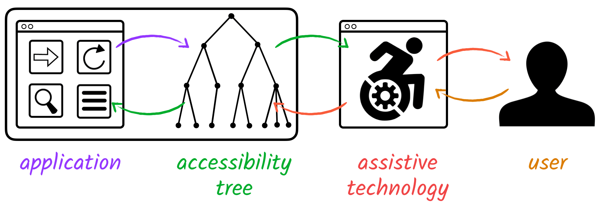
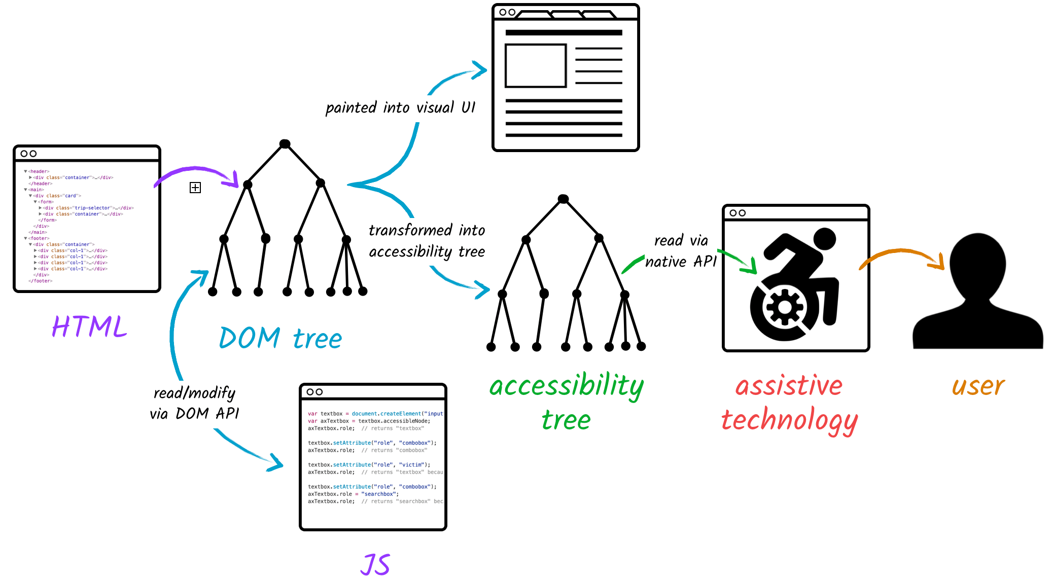
The appendices, above, are the source of the notes and figures that follow in this section.
Assistive technologies interact with web pages and applications through platform-specific accessibility APIs that expose a tree of objects referred to as the accessibility tree.

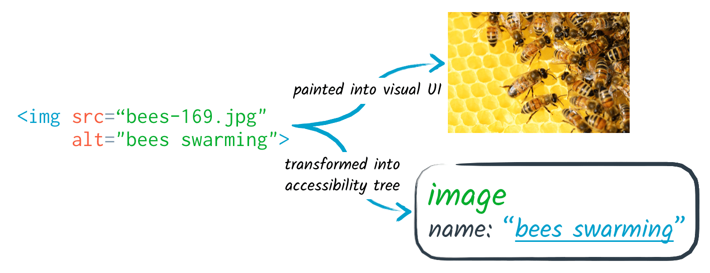
In web browsers, the structure and content of a web page’s markup is represented by a Document Object Model (DOM) tree (MDN Contributors 2021b). The DOM tree is, then, translated into both the visual representation (what you see in the browser), and the accessibility tree, which can be accessed by platform-specific accessibility APIs, which bring the information to the user via assistive technologies.

Each node of the accessibility tree (referred to as an accessibility node) has a role2, which indicates its semantic purpose. Native HTML elements are implicitly mapped to accessibility notes with their semantic roles—e.g. an <img> element becomes an accessibility node with the role of “image”.

Some nodes have a grouping role, helping users to meaningfully navigate the page. Others, such as <summary>, have a state (in the case of <summary>, collapsed or expanded). For more on Accessible Rich Internet Application (ARIA) role types, see the Mozilla Developer Network (MDN) Using ARIA: Roles, states, and properties.
For more formal definitions of the accessibility tree see:
Accessibility tree (MDN Contributors 2021c) in the MDN Web Docs Glossary, and
The Accessibility Tree (Kearney, Gash, and Boxhall 2020) from Google Dev Web Fundamentals.
I also recommend How accessibility trees inform assistive tech by accessibility expert, Hidde de Vries (de Vries 2019).
References
Footnotes
As defined in the WCAG 2.1 Standard, assistive technology is: “hardware and/or software that acts as a user agent, or along with a mainstream user agent, to provide functionality to meet the requirements of users with disabilities that go beyond those offered by mainstream user agents” (O’Connor et al. 2018).↩︎
See MDN docs on WAI-ARIA roles for details.↩︎
Reuse
Citation
@online{averick2022,
  author = {Averick, Mara},
  title = {CSS {Grid} and Accessibility},
  date = {2022-02-14},
  url = {https://dataand.me/notes/2022-02_css-grid-and-accessibility/},
  langid = {en-US}
}